No, I have not fallen off the face of the earth again, but have been south (more about my visit later while I stay on track today and remain true to my earlier promises), and have had a week-long visit from special family members - notably grandson #1. Now to John Saladino who has been one of my favorite designers from House Beautiful's Home Decorating to his recent publication of Villa. Today, let's take a look at his early work and decide if we think Saladino design was warm and cozy then and, later decide, if it is today.
As you will see, in 1981, not all magazine photos were in color.
Below is the front door of a former ice house converted into a guest cottage by John and Virginia Saladino in '81. To the left of the door rests an 18th-Century stone bowling ball (similar to three new spheres I purchased from Lunaform in Maine resting near my own front door.)
"There are no pretty accessories, no flounces--(Saladino) used classic period furnishings in a contemporary way." I loved this room then and still do - so clean, almost Belgian-esque yet in an American way. The wall hanging is an Amish blanket framed.
Another view of living room.
Shaker table place beneath the living room window.
Cottage's simply designed bedroom with Saladino lighting. Because of the room's simplicity, the antiques stand out. Cozy? Yes? No?
Fast forward to Spring 1986 with Better Homes and Gardens Decorating.
The rooms which follow are of a 1722 house in Litchfield Connecticut owned by Arlene Hoffman, a New York advertising executive, and her partner, Ray Gaulke. In their restoration process, the couple did extensive research on the house and its decor, but sought the advice of John Saladino. I think you will see his influences.
View from front door to the front garden.
Very Litchfield, Connecticut.
Front foyer with antique settle and contemporary artwork. Newly carved niche, serving as a powder room, "gets just the right touch of antiquity with a sink set into an old wrought-iron plant stand."
Close-up antique drop-leaf table and ladder back chairs in music room. I particularly love the window treatments in this home because they either do not exist or they are shutters. Love, love interior shutters and the paneled ones throughout are great.
Music room is one of the four main living areas on ground floor. "Music room" is what previous owners called this room. Wood burning stove was one of the "few nods to modern convenience" which the owners added - for warmth.
Peek into dining room from the main hall.
The dining room with its blend of very new and very old is the only room in the house that is not a creamy white. The warm red color is so inviting. A designer once told me red is perfect for dining rooms because, when in them, people feel convivial and cozy, and look wonderful. It certainly worked in my friend's house and looks like it does here also.
A very Saladino-esque blend of old and new evident in the living room below. Note the continuity in the sofa fabric matching the seats in dining room. The new upholstered pieces blend well with antique collections. But, remove the upholstered pieces and we could be in the "Wyeth country" of my earlier posts.
On the other side of the living room, another gate leg table, this time with windsor chairs, shares space with a classic Eames chair and ottoman. Bookcase and fireplace are icons of cozy. Hidden behind a beam, lights wash over the bookshelves.
Four poster bed and quilt are new, other pieces are antique in master bedroom.
In the master bath, a one-of-a-kind sink is matched with contemporary goose-necked faucet. Sink is an Italian mortar - so cool.
And now to my favorite part of the house, the kitchen of course. Sadly, the stainless steel appliances are out of view, but I'll bet they perfectly cooled down the mellow woods seen here. First a peek from the back door...
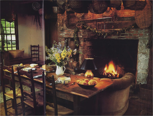
then a fuller view. Love how the kitchen table is right behind the tufted sofa, but I so wish I could see "the six-burner commercial stove and the hotel-size floor-to-ceiling refrigerator." Bet the editors of Better Homes and Gardens thought readers would not "get" such a juxtaposition in 1986, but I would have. Mary Emmerling did. (More about Mary later.)
Arlene Hoffman in Chicago in 2011. She moved near her only son and is seen here surrounded by her books and her Biedermeier furnishings. Do you think she misses Litchfield or has she never looked back?
So can John Saladino be warm and cozy? I always thought so from seeing, studying and loving these long-ago images. If you disagree, that's fine, but just wait till my next post.
Till then,
b


Welcome back, Billie!!! Oooooh, a new post! Have missed you. Just got your email link. Thanks for sending that. These classic Saladino interiors.....amazing!!! (Have not seen them.) He is the best. Just as good back then. Very warm, because of all the books and darkwood.
ReplyDeletexo
L